
Can you design for your ideal customer and as many people as possible at the same time?
If you’re a left-handed person, you know all too well that we live in an extremely right-handed world. From scissors, ring-bound notebooks, and vegetable peelers to door handles, camera shutter buttons and even ice-cream scoopers – everyday objects are either uncomfortable or impossible for you to use.
You’re being excluded from fully experiencing these products the way right-handed people do. It seems like a small group of people are left-handed when you say they make up 10% of the population, but that’s 775 300 000 people – almost the populations of the US, India and Pakistan combined.
No, you didn’t accidentally tap on an article about the plight of left-handed people. This is still a blog about inclusive design. But the example of how left-handed people interact with a right-handed world illustrates perfectly how necessary inclusive design is.
So, what is it, why should you care and how do you start embracing it?
What’s the difference between accessible and inclusive design?
Accessible design and inclusive design often get mixed up. While the two terms are related, they’re not the same, and it’s essential to understand the difference to gain a better idea of how they work together.
Accessible design aims to create digital products that people with disabilities can use. These include physical, visual, auditory and cognitive impairments. You can think of accessible design as one component of the bigger inclusive design picture. The Web Content Accessibility Guidelines were established to govern what accessible interfaces look like, which has made it easier for designers to achieve.
Inclusive design is a framework and way of thinking that ensures that all digital products are designed for people of different backgrounds and abilities. Inclusive design addresses age, race, gender, geography, culture, class, education and language. It asks designers to use empathy and research to design for people whose needs aren’t always met. Through inclusive design, the goal is to achieve user interfaces and products that avoid excluding users as much as possible.
Why is inclusive design essential?
According to the Extra Cost Commission, £2 billion is lost every month globally by businesses only catering to “normal” people.
It may seem like inclusive design is additional work (which it is), but it isn’t all for the sake of feeling good about your brand. Yes, it’s the right thing to do and contributes to the greater social good, but it can also benefit your business. Let’s look at some of the benefits.
- Increase your target audience – by considering the lived experiences of more people when you design, your product is primed to reach more people. This exposes your brand to a broader audience so you can win more customers.
- Improve your brand reputation – today’s consumer supports brands that stand for a good cause, and inclusion, by definition, benefits all. Aligning your brand with your customers’ values is an excellent way to boost your reputation and encourage loyalty.
- Inspire innovation – you can stumble upon solutions to even more problems when you’re consistently designing for perspectives outside of your own. This could lead to the sharpening of existing products, inspiration for new ones and the unlocking of additional revenue streams.
How to get started with inclusive design
The golden rule of inclusive design is that you are not your user. Designers fall into the trap of thinking they can put themselves in their users’ shoes, but this often means other people who navigate the world the same way they do. These are some basic guidelines to help you kick-start your inclusive design thinking.
1. Start with inclusive research
Without research, you’re making dangerous assumptions about what all your customers’ needs are. Thorough research should include perspectives from different age groups, genders, ethnic and cultural backgrounds and various socio-economic spheres. Surveys and usability testing are excellent methods of uncovering insights about your users.
2. Recognise exclusions and avoid biases
Now, based on your inclusive research, identify as many exclusions in your prototype as possible. It’s crucial at this stage to avoid any of your personal biases. It’s helpful to design collaboratively with a team who can look at your work with fresh eyes and perspectives. Are your images and illustrations diverse? Is your text legible by all people? Questions like these get you closer to an inclusive product.
3. Give your users options
Think about a variety of ways that users can complete tasks. For example, just because special characters aren’t allowed in name and surname input fields on every other platform doesn’t mean you should do the same. Think about cultures with hyphens, apostrophes and accents in their names – how can you accommodate these people?
4. Add value at every stage
Whatever you adjust in your design prototype should be a valuable addition to the product, particularly for the user. Adding closed captions to your multimedia and optimising your content for screen readers doesn’t only make your UI more accessible to deaf and blind people, but it has the side effect of being great for SEO too.
And now for a bit of show and tell…
That concludes your crash course on inclusive design, but what would a design blog be without some handy visual aids? Here are some killer examples of inclusive design by famous brands.
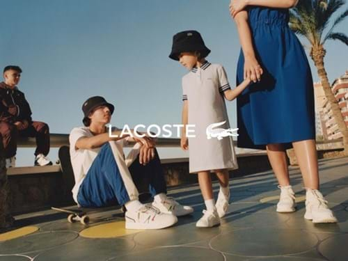
Lacoste
Lacoste launched a campaign in May 2022 that highlighted that their streetwear is for everyone. A series of print ads and commercials show people of different ages, races and genders wearing the same clothes.


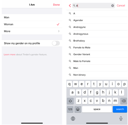
Tinder
When creating an account, Tinder gives users more options than the thoughtless “Man-Woman-Other” gender markers that are typical on other platforms. It allows users to start typing their gender identifiers and choose from more than 50 options.
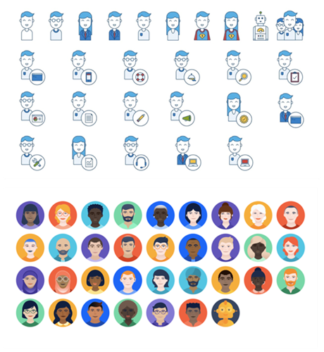
Atlassian
Atlassian updated its illustrations from minimal outlines (which read as white) to a more deliberately diverse set of characters.
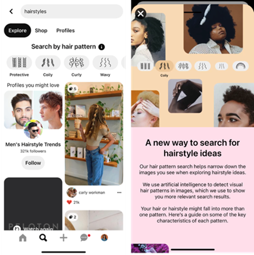
When searching for hairstyles on Pinterest, you can select the hair texture and pattern that matches what you're looking for so you get more valuable results and avoid the white bias typical of most image search algorithms.
We hope we’ve succeeded in making a case for inclusive design. As society becomes increasingly digital, the internet is not just another part of the world – it is the world. And, as any leftie will tell you: a world without inclusive design is not all right.
We’ve written about inclusive digital marketing practices here, here, here and here. Read up and get in touch with us when you’re ready to join the cause.
