
Much like the rest of the world, South Africans are glued to their smartphones and are adept at using them to access applications and services. There are 28.99 million active mobile internet users in South Africa according to Statista, 2019 and South Africa's smartphone penetration has almost doubled in 2016 from 43.5% to 81.72% at the end of September 2018.
And here lies the answer to why a mobile-friendly website matters. With business decision-making taking place on mobile devices, you can’t rely solely on desktop-oriented sites and expect great business outcomes. If you need more reasons why your website should be mobile-friendly, that’s what I’m here for. So let’s unpack the technicalities.
Google is watching you
Let’s get one thing straight, your pages are mobile-friendly or they aren’t – there’s no in-between. Google can tell the difference and so can your visitors. What does this mean for your business? If your website lacks a responsive web design it will ruin the user experience. This, in turn, will affect your traffic and conversion opportunities. Google changed the way it displayed mobile searches in 2015, and to cut a long story short, it prioritises mobile-friendly websites when a search is made on a mobile device.
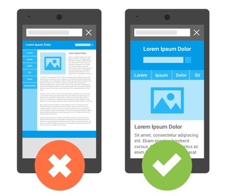
From 1 July 2019, Google has enabled mobile-first indexing by default. So what does this mean for your website? If you only have a desktop version of your website, what users see on the desktop is what they will see on a mobile device. It’s like the image depicted below. Do you really want to navigate through that? The option on the left will involve scrolling from side to side and zooming in – that’s if you stay on the website that long.
Give the people what they want
You’ll find that mobile customers don’t have the same behaviour patterns as desktop customers. Mobile users are generally looking for specific information while time-consuming, in-depth research is usually reserved for the comfort of laptops and desktops. Mobile sites are better suited to cater to this behaviour. Content is easy to consume and mobile-friendly websites are also quicker to load.
Mobile visitors tend to buy more
A mobile website makes it convenient for shoppers because they can be accessed from pretty much anywhere, which helps with impulse buys. With this in mind, accessible websites will enhance the customer experience and the better the experience the more likely they are to buy your product or service.
Even if you offer some of the most unique products or services on the market, if your website’s mobile experience is poor or non-existent, your company will be viewed as a digital dinosaur. This will lead to people seeking out your competitors.
Mobile-friendly websites are contemporary, cutting-edge and sleek. They will help you to get your foot in the door with anyone who owns a smartphone.
Responsive web design
League Digital employs what’s known as responsive web design. It’s fluid in the sense that the design will respond to changes in the width of the browser to fit the available space. This depends on which device you’re requesting the website from. To successfully execute a responsive design, you need to have a very good concept of the site and a deep knowledge of the end users.
Web development isn’t just about building websites. The principles for good website development depend on the right mix of digital assets. With so many digital assets available to you, how do you choose? You need to create digital assets that will cater for the best possible user experience.
In essence, these are the people who will interact with your website.
Make good design and development choices with League Digital.
Image source: https://developers.google.com/search/mobile-sites/
